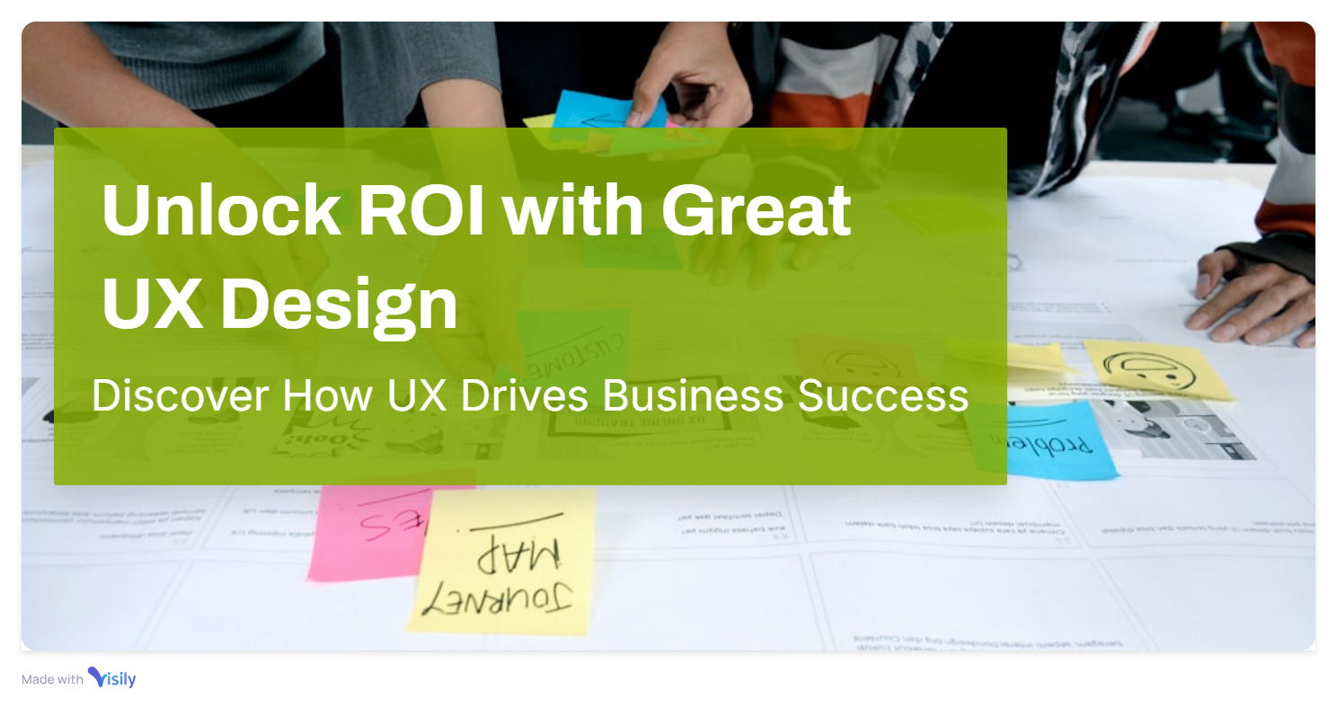
Evidence-based design. Built on what we learned. Scaled for how you'll grow. We bridge the gap between user needs and business goals.
At LotuX Studio, our design stage is the critical bridge between research-driven insights and technical execution. We don't guess; we validate every pixel against the personas and user flows identified in the Research phase.
Our team specializes in creating scalable design systems that evolve with your product. Whether you are a startup building your first MVP or an enterprise modernizing a legacy web app, our iterative design process ensures clarity, accessibility, and high conversion rates.
We utilize industry-leading tools and a rigorous review cycle to ensure that the transition from Figma to code is seamless. Our design output is "developer-ready," meaning your engineering team spends less time interpreting and more time building.
The complete design layer — from first user flow to final production-ready file
Our full UX and UI design service covers everything from post-research through developer handoff. User flows, wireframes, full UI design system, interactive prototype, and a handoff-ready Figma file that any competent developer can implement without a single follow-up call. Every decision is documented. Every component is system-linked. Every prototype is user-tested before handoff.
Document every path a user can take — primary success flows, edge cases, error states, and empty states. The structural blueprint before any visual decisions are made.
Low-to-mid fidelity layouts establishing structure, content hierarchy, and navigation logic. Reviewed and approved before visual design begins — no wasted visual design cycles.
Full visual interface design with component library, spacing system, typography scale, colour palette, and interaction patterns — production-ready, not just presentable.
Figma prototype with realistic click-through interactions for stakeholder review, investor presentation, and user testing validation before development starts.
Complete annotated Figma file with spacing specs, typography documentation, interaction notes, asset exports, and component usage guidelines — everything needed to build accurately.
From validated idea to investor-ready design — in 4–8 weeks
Full-product UX/UI design for founders and teams building something new. Research, information architecture, all screens and states, interaction design, and a validated prototype — research-grounded, investor-ready, and ready for development or fundraising simultaneously. We have designed MVPs that closed seed rounds and launched to users in the same month.
Stakeholder workshops, assumption mapping, jobs-to-be-done, and feature prioritisation — defining what the MVP must include, and critically, what it must not.
Lightweight research to validate core assumptions before design investment. Prototype-based user testing before development budget is committed.
All screens, all states, all platforms — designed to production quality with a reusable component library ready for developer handoff.
Pitch-ready visual design consistent with your product UI — professionally structured, credibly presented for seed and Series A conversations.
Your single source of truth — for designers, developers, and every product decision.
A design system is not a component library. It is the shared language between designers and developers — the documented standards and reusable components that allow your product to scale without fragmenting visually or functionally. LotuX builds systems that are actually used: clearly documented, logically structured, built with developer workflow in mind. Result: faster sprints, fewer inconsistencies, better product quality over time.
All UI components with every state documented — default, hover, active, focused, disabled, error, loading. Consistent and production-ready from day one.
Foundational values — colour, typography, spacing, shadows, border radius — defined as tokens bridging Figma and codebase, enabling single-source design updates.
Written documentation on when and how to use each component — preventing misuse, reducing design decisions, accelerating team onboarding.
For existing products: review and rationalise an existing component set to remove inconsistencies and establish a single maintainable source of truth.
Complex products deserve design that matches their complexity.
Web app design is fundamentally different from website design. Data-heavy screens, multi-role flows, permission states, empty states, loading states, bulk actions — each requires design decisions rarely encountered in marketing website work. LotuX specialises in the UX of complexity: SaaS platforms, internal tools, admin panels, analytics dashboards, enterprise web applications. We design for real usage patterns — including edge cases, power users, and when things go wrong. Typical delivery: 4–6 weeks.
Screens where data must communicate — not just display. Charts, tables, KPIs, filters designed with information hierarchy that guides users to the right insight.
Products serving admins, managers, end users, and viewers — each with appropriate access, tailored interface, and context-specific UX without architectural conflict.
Web app-specific component set: data tables, form validation patterns, modal systems, toast notifications, empty states, navigation structures — documented for development.
Platform-native mobile design — not a website made smaller.
Designing for mobile is a distinct discipline. Thumb-reachability, gesture logic, haptic feedback patterns, push notification UX, offline states, App Store requirements — none of these apply to desktop, and most agencies treat them as afterthoughts. LotuX designs apps that feel native: following Human Interface Guidelines and Material Design 3 where they serve users, departing confidently where a better solution exists
HIG-compliant screens, App Store-ready assets, iOS navigation patterns, typography, iconography, and interaction design specific to the iOS platform.
Material Design 3-informed design adapted to your product's visual identity — platform-appropriate without being platform-generic.
WCAG 2.1 AA compliance review: contrast ratios, touch target sizing, screen reader compatibility, and keyboard/switch navigation paths.
Your website is a sales tool. We design it like one.
A marketing website has one job: turn visitors into conversations. Every layout decision, headline, visual hierarchy choice, and CTA placement should serve that job — not your leadership team's communication preferences, and not a design portfolio. LotuX designs websites with conversion architecture as foundation: trust-building at the top, value communication throughout, friction removal everywhere. Visual design comes last.
Structure each page around the visitor's decision journey — their questions, their hesitations, and the sequence of evidence they need to feel confident enough to act.
Brand-aligned, mobile-first, high-fidelity page designs ready for CMS development, Webflow, or custom development.
Heading hierarchy, content structure, and internal link architecture designed for both users and search engines from the first wireframe — not retrofitted at the end.
UX (User Experience) design covers the structure, flows, and behaviour of a product — how it works. UI (User Interface) design covers the visual layer — how it looks. At LotuX, both are delivered together, with UX always preceding UI.
UX + UI design: 4–6 weeks. MVP design: 6–8 weeks. Design system: 4 weeks. Website design: 3–4 weeks. All timelines are confirmed in the scoping session.
Yes. All design is delivered as production-ready Figma files with design system components, interaction specs, spacing annotations, and asset exports.
Both. We redesign existing products — starting with a UX audit to understand what's breaking before proposing changes.
Yes. Brand strategy and visual identity are available as part of our Grow services.
Excelent work. 100% recommended. Kam is an excellent. His work is done perfectly accurate, and always on the schedule. He is very communicative which is something very appreciable in this type of work. I highly recommend him. 100% quality work.
The design piece was great. Great team to work with.
One of the best designer I have seen. Has all the skills to make your website or mobile app look Great . Just needs to be little more faster but if you are willing to wait little longer he is going to be worth the Wait and he is very helpful and has good ideas
Appreciate LotuX team work. I will refer him for further work and also give his reference to other colleague